Distributions and Descriptive Statistics in Python
This tutorial introduces distributions and descriptive statistics in Python using pandas and helper functions that mirror R's syntax.
Getting Started
Install and Import Packages
%pip install pandas plotnine scipy
import os, sys
import pandas as p
from plotnine import *
sys.path.append(os.path.abspath('functions'))
from functions_distributions import *
Our Data
sw = p.Series([4.5, 5, 5.5, 5, 5.5, 6.5, 6.5, 6, 5, 4])
sw
Size
Length
len(sw)
Location
Mean and Median
sw.mean()
sw.median()
Mode
sw.mode()
Spread (1)
Percentiles
sw.quantile(q=0)  # min
sw.quantile(q=1)  # max
sw.quantile(q=.75)
Spread (2)
Standard Deviation, Variance, CV, SE
# Manual SD (sample)
x = ((sw - sw.mean())**2).sum()
x = x / (len(sw) - 1)
x**0.5sw.std()
sw.var()
sw.std()**2
sw.std() / sw.mean() # CVse = sw.std() / (len(sw)**0.5) se
Suppose we collected data on 10 randomly selected chunks of cheese from a production line! We measured their moisture in grams (g) in each product. We want to make sure we're making some quality cheesy goodness, so let's find out how much those moisture (cheesiness) levels vary!
The moisture in our cheese weighed 5.52 g, 5.71 g, 5.06 g, 5.10 g, 4.98 g, 5.50 g, 4.81 g, 5.55 g, 4.74 g, & 5.39 g.
- Please convert the following values into a Series named
cheese! - What was the average moisture level in the sample?
- How much did moisture levels vary, on average?
- We need to compare these levels with cheese produced in Vermont, France, and elsewhere. What's the coefficient of variation and standard error for these moisture levels?
📝 Quick check: Which single statistic reports how much the moisture levels varied, on average, from the mean?
.std() — pandas gives you the sample standard deviation by default. CV = .std() / .mean(); SE = .std() / (len(x)**0.5).1. Please convert the following values into a Series named cheese!
cheese = p.Series([5.52, 5.71, 5.06, 5.10, 4.98, 5.50, 4.81, 5.55, 4.74, 5.39])
2. What was the average moisture level in the sample?
# Get mean of values
cheese.mean()
# 5.236
3. How much did moisture levels vary, on average?
# Get standard deviation of values.
# Fun fact: this is how much they varied on average FROM THE AVERAGE
cheese.std()
# 0.3399
4. What's the coefficient of variation and standard error?
# Coefficient of variation
cv = cheese.std() / cheese.mean()
cv
# 0.0649

# Standard Error
se = cheese.std() / (len(cheese)**0.5)
se
# 0.1075

# When you're finished, remove extra data.
del cheese, se, cv
The standard deviation is only ~6.5% of the size of the mean, so this production line is pretty consistent — and the standard error tells us how precisely we've pinned down that mean, given only 10 chunks of cheese.
Shape
Skewness and Kurtosis
diff = sw - sw.mean()
n = len(sw) - 1
sigma = sw.std()
sum(diff**3) / (n * sigma**3)
sum(diff**4) / (n * sigma**4)
# Using helper functions mirroring R
skewness(sw)
kurtosis(sw)A contractor is concerned that the majority of seawalls in her region might skew lower than their region's vulnerability to storms requires. Assume (hypothetically) that our sample's seawalls are the appropriate height for our level of vulnerability, and that both regions share the same level of vulnerability.
- The
meanseawall in her region is about the same height as in our sample (~5.35), but how do theskewnessandkurtosisof her region's seawalls compare to our sample? - Her region has 12 seawalls! Their height (in meters) are 4.15, 4.35, 4.47, 4.74, 4.92, 5.19, 5.23, 5.35, 5.55, 5.70, 5.78, & 7.16.
Calculate these statistics and interpret your results in a sentence or two.
📝 Quick check: Using the by-hand formula on her 12 seawall heights, the skewness is…
**3 over (n-1) * sigma**3; kurtosis uses **4 over (n-1) * sigma**4. Or just call the skewness() and kurtosis() helpers.# Make a Series of these 12 seawalls x = p.Series([4.15, 4.35, 4.47, 4.74, 4.92, 5.19, 5.23, 5.35, 5.55, 5.70, 5.78, 7.16]) # Ingredients: differences, conservative sample size, standard deviation diff = x - x.mean() n = len(x) - 1 sigma = x.std() # Calculate skewness skew = (diff**3).sum() / (n * sigma**3) # Calculate kurtosis kurt = (diff**4).sum() / (n * sigma**4) # View them! [skew, kurt] # [0.9017, 3.5201] # Same answer, using the helper functions: skewness(x) kurtosis(x)
- Her region's seawalls are somewhat positively, right skewed, with a skewness of about
+0.90. This is much more skewed than our hypothetical area's seawalls, which are skewed at just+0.02. - But, her region's seawalls' traits are much more closely clustered around the mean than ours, with a kurtosis of
3.52compared to our1.88. - Since both hypothetical regions have comparable levels of vulnerability to storm surges, her region's seawalls do appear to skew low.
Finding Parameters for Your Distributions
sw = p.Series([4.5, 5, 5.5, 5, 5.5, 6.5, 6.5, 6, 5, 4])
mymean = sw.mean()
mysd = sw.std()
Common Distributions
Normal
mynorm = rnorm(n=1000, mean=mymean, sd=mysd)
h1 = hist(mynorm)
h1.save("plotnine_figures/02_hist_normal.png", dpi=100, width=6, height=4)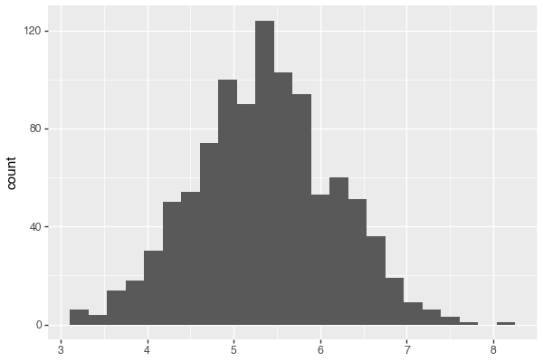
Poisson
mypois = rpois(n=1000, mu=mymean)
h2 = hist(mypois)
h2.save("plotnine_figures/02_hist_poisson.png", dpi=100, width=6, height=4)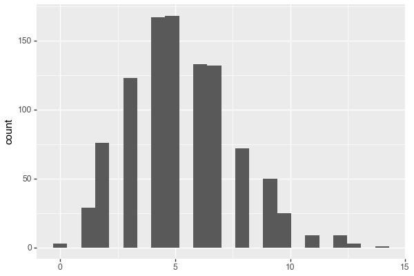
Exponential
myrate_e = 1 / sw.mean()
myexp = rexp(n=1000, rate=myrate_e)
h3 = hist(myexp)
h3.save("plotnine_figures/02_hist_exponential.png", dpi=100, width=6, height=4)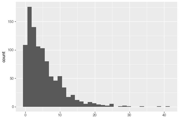
Gamma
myshape = sw.mean()**2 / sw.var()
myrate = 1 / (sw.var() / sw.mean())
mygamma = rgamma(n=1000, shape=myshape, rate=myrate)
h4 = hist(mygamma)
h4.save("plotnine_figures/02_hist_gamma.png", dpi=100, width=6, height=4)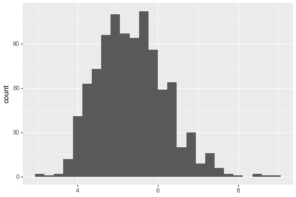
Weibull
from scipy import stats as fitdistr
myshape_w, loc, myscale_w = fitdistr.weibull_min.fit(sw, floc=0)
myweibull = rweibull(n=1000, shape=myshape_w, scale=myscale_w)
h5 = hist(myweibull)
h5.save("plotnine_figures/02_hist_weibull.png", dpi=100, width=6, height=4)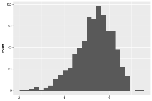
Comparing Distributions
mysim = p.concat([
  p.DataFrame({'x': sw, 'type': "Observed"}),
  p.DataFrame({'x': mynorm, 'type': "Normal"}),
  p.DataFrame({'x': mypois, 'type': "Poisson"}),
  p.DataFrame({'x': mygamma, 'type': "Gamma"}),
  p.DataFrame({'x': myexp, 'type': "Exponential"}),
  p.DataFrame({'x': myweibull, 'type': "Weibull"})
])

g1 = (ggplot(mysim, aes(x='x', fill='type')) +
  geom_density(alpha=0.5) +
  labs(x='Seawall Height (m)', y='Density (Frequency)', subtitle='Which distribution fits best?', fill='Type'))
g1.save("plotnine_figures/02_density_comparison.png", dpi=100, width=8, height=6)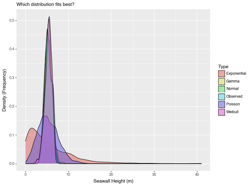
g2 = g1 + xlim(0,10)
g2.save("plotnine_figures/02_density_comparison_xlim.png", dpi=100, width=8, height=6)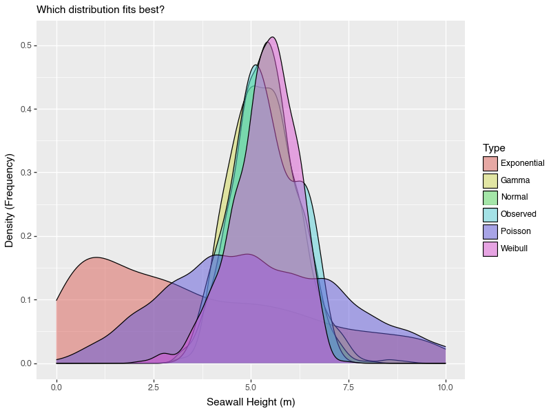
swSimulate 1000 draws from a normal distribution using your sw mean and standard deviation. What are the simulated mean and sd? How close are they to sw's?
rnorm() fed with sw.mean() and sw.std(), then compare the simulated Series' own .mean() and .std() back to sw's.mymean = sw.mean(); mysd = sw.std() m = rnorm(1000, mean=mymean, sd=mysd) [m.mean(), m.std()]
You've been recruited to evaluate the frequency of Corgi sightings in the Ithaca Downtown. A sample of 10 students each reported the number of corgis they saw last Tuesday in town. Using the method of moments (or weibull_min.fit() for Weibull) and ggplot(), find out which type of distribution best matches the observed corgi distribution!
Beth saw 5, Javier saw 1, June saw 10(!), Tim saw 3, Melanie saw 4, Mohammad saw 3, Jenny saw 6, Yosuke saw 4, Jimena saw 5, and David saw 2.
.mean(), .std(), gamma shape/rate from the method of moments, exponential rate, Weibull via fitdistr.weibull_min.fit(corgi, floc=0)), simulate each distribution with rnorm()/rpois()/rgamma()/rexp()/rweibull(), stack them with p.concat(), then geom_density().First, let's get the stats.
# Make distribution of Corgis
corgi = p.Series([5, 1, 10, 3, 4, 3, 6, 4, 5, 2])

# Compute statistics for distributions
corgi_mean = corgi.mean()               # 4.3
corgi_sd = corgi.std()                  # 2.4967
corgi_shape = corgi.mean()**2 / corgi.var()          # 2.9663
corgi_rate = 1 / (corgi.var() / corgi.mean())        # 0.6898
corgi_rate_e = 1 / corgi.mean()                      # 0.2326

# For Weibull, fit the parameters with scipy, holding the location at 0
from scipy import stats as fitdistr
corgi_shape_w, loc, corgi_scale_w = fitdistr.weibull_min.fit(corgi, floc=0)
# shape 1.9207, scale 4.8617
Next, let's stack them together.
corgisim = p.concat([
  p.DataFrame({'x': corgi, 'type': "Observed"}),
  p.DataFrame({'x': rnorm(n=1000, mean=corgi_mean, sd=corgi_sd), 'type': "Normal"}),
  p.DataFrame({'x': rpois(n=1000, mu=corgi_mean), 'type': "Poisson"}),
  p.DataFrame({'x': rgamma(n=1000, shape=corgi_shape, rate=corgi_rate), 'type': "Gamma"}),
  p.DataFrame({'x': rexp(n=1000, rate=corgi_rate_e), 'type': "Exponential"}),
  p.DataFrame({'x': rweibull(n=1000, shape=corgi_shape_w, scale=corgi_scale_w), 'type': "Weibull"})
])
Finally, let's visualize it!
# Visualize!
g3 = (ggplot(corgisim, aes(x='x', fill='type')) +
  geom_density(alpha=0.5) +
  xlim(0,15) +
  labs(x='Corgi Sightings!', y='Density (Frequency)', fill='Type'))
g3.save("plotnine_figures/02_density_corgi.png", dpi=100, width=8, height=6)
Neat — looks like the Poisson, Gamma, and Weibull function match well, although the Poisson looks pretty odd!
Conclusion
You computed size, location, spread, and shape statistics and compared common simulated distributions using helper functions that mirror R.