Visualization with ggplot in R
Visualization is a key part of statistical analyses, especially in systems engineering! Visuals themselves are often the analysis themselves! In this tutorial, we're going to learn how to visualize data in the ggplot2 package.
Please follow along using the code below!
Getting Started
Loading Packages
Let's load our packages with library().
# Data viz and data manipulation packages
library(ggplot2)
library(dplyr)
# Data sources
library(gapminder)
Notes:
- SAVE YOUR SCRIPT.
- Always comment your code (what I'm doing now),
- use lots of spaces, and keep it clean.
Gapminder data
Economist Hans Rosling made a dataset that examines change in life expectancy over time for most countries in the world. It is contained in the gapminder package!
# Let's view it. (see console below)
gapminder
Each row is a country-year, marking the life expectancy, population, and gross domestic product (GDP) per capita. On your end, you can only can see some of it, right?
Let's check out what vectors are in this dataframe, using the glimpse function from the dplyr package.
# (Remember, a vector is a column in a spreadsheet;
# a data.frame is a spreadsheet.)
glimpse(gapminder)
# Nice, we can see things more concisely.
Our data has six variables. Great!
Your first scatterplot
Using the gapminder data, let's map a series of vectors to become aesthetic features in the visualization (point, colors, fills, etc.).
ggplot(data = gapminder, mapping = aes(
  # Let's make the x-axis gross-domestic product per capita (wealth per person)
  x = gdpPercap,
  # Let's make the y-axis country life expectancy
  y = lifeExp))
Huh! We made an empty graph. Cool.
That's because ggplot needs helper functions to add aesthetic features to the graph.
For example, adding + geom_point() will overlay a scatterplot.
# Make a scatterplot
ggplot(data = gapminder, mapping = aes(x = gdpPercap, y = lifeExp)) + # same as above, except "+"
  geom_point()
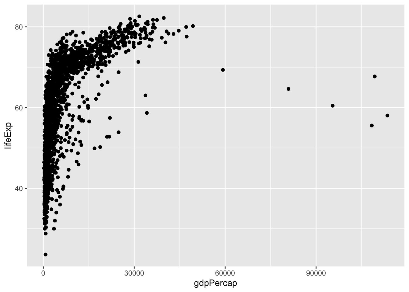
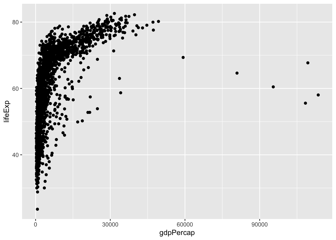
What kind of relationship does this graph show? Why might it matter to policymakers?
The graph above shows that as average wealth (GDP per capita) in a country increases, those countries' life expectancy increases swiftly, but then tapers off. This highlights that there is a strong relationship between wealth and health globally.
What happens when you add the alpha, changing its values in the 3 visuals below?
# Run the following code:

ggplot(data = gapminder, mapping = aes(x = gdpPercap, y = lifeExp)) +
  geom_point(alpha = 0.2)

ggplot(data = gapminder, mapping = aes(x = gdpPercap, y = lifeExp)) +
  geom_point(alpha = 0.5)

ggplot(data = gapminder, mapping = aes(x = gdpPercap, y = lifeExp)) +
                               geom_point(alpha = 1)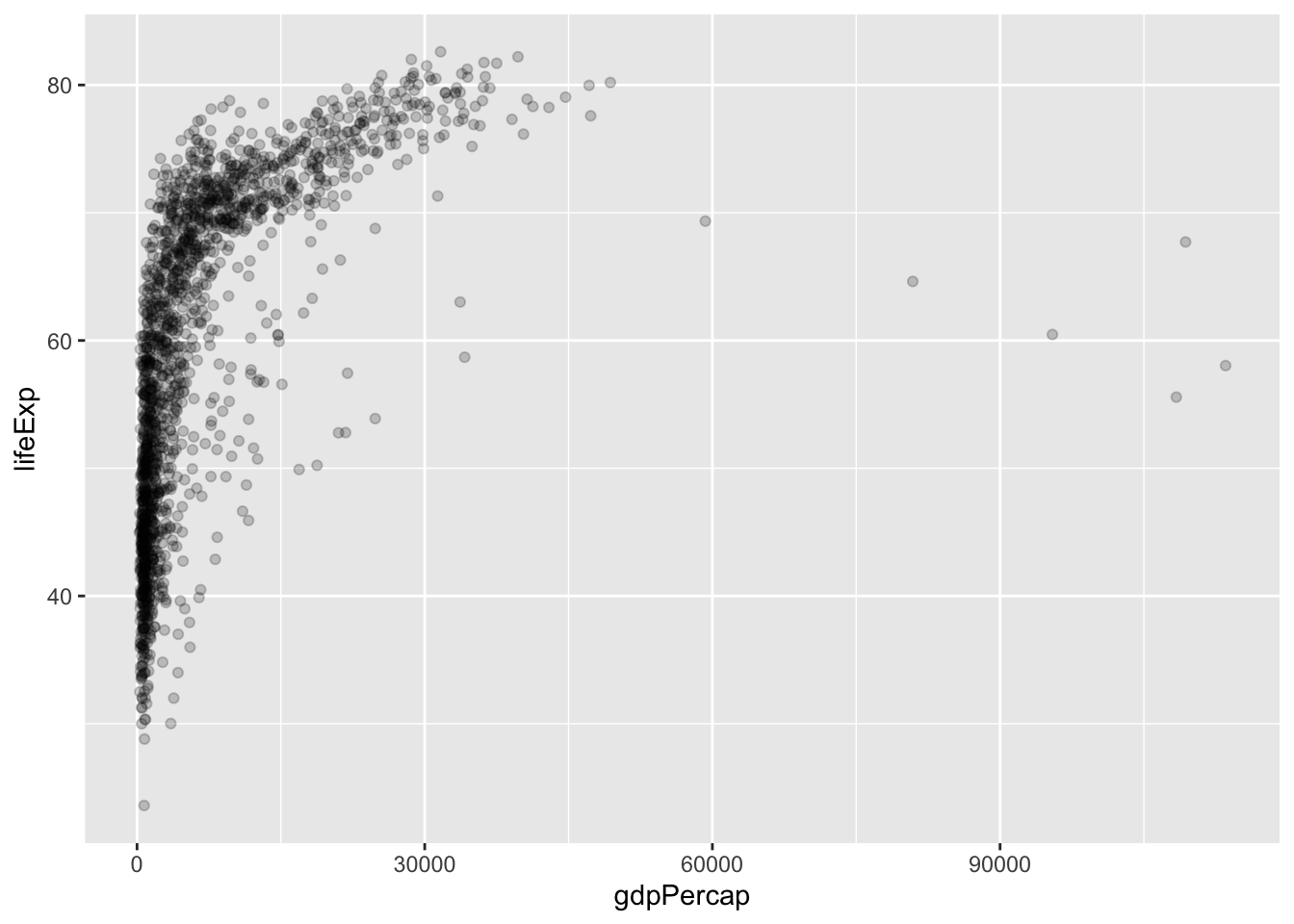
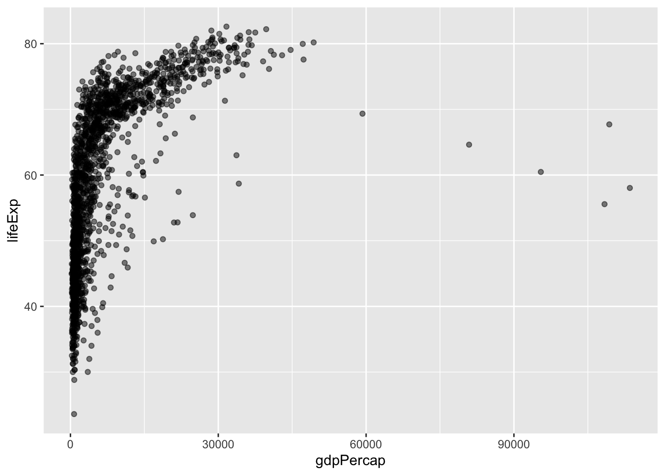
alpha controls point transparency, not size or color — try comparing the three plots' overlap density at low vs. high GDP.alpha ranges from 0 to 1 and describes feature transparency. Increasing alpha to 1 makes points fully opaque! Decreasing alpha to 0 makes points fully transparent!
We can make it more visually appealing. What happens when we do each of the following?
- If you want to make it a single color, where do you need to write
color = ...? - If you want to make it multiple colors according to a vector, where do you need to write
color =?
# Run the following code:

# Version 1
ggplot(data = gapminder, mapping = aes(x = gdpPercap, y = lifeExp)) +
  geom_point(alpha = 0.5, color = "steelblue")

# Version 2
ggplot(data = gapminder, mapping = aes(x = gdpPercap, y = lifeExp, color = continent)) +
  geom_point(alpha = 0.5)
aes() only affects things that vary by row of data; anything written outside aes() applies uniformly to every point.To assign a single color, you need to put color outside the aes() phrase, and write the name of the color.
To assign multiple colors, you need to put the color inside the aes(...) phrase, and write the name of the vector in the data that it corresponds to (eg. continent).
Improving our Visualizations
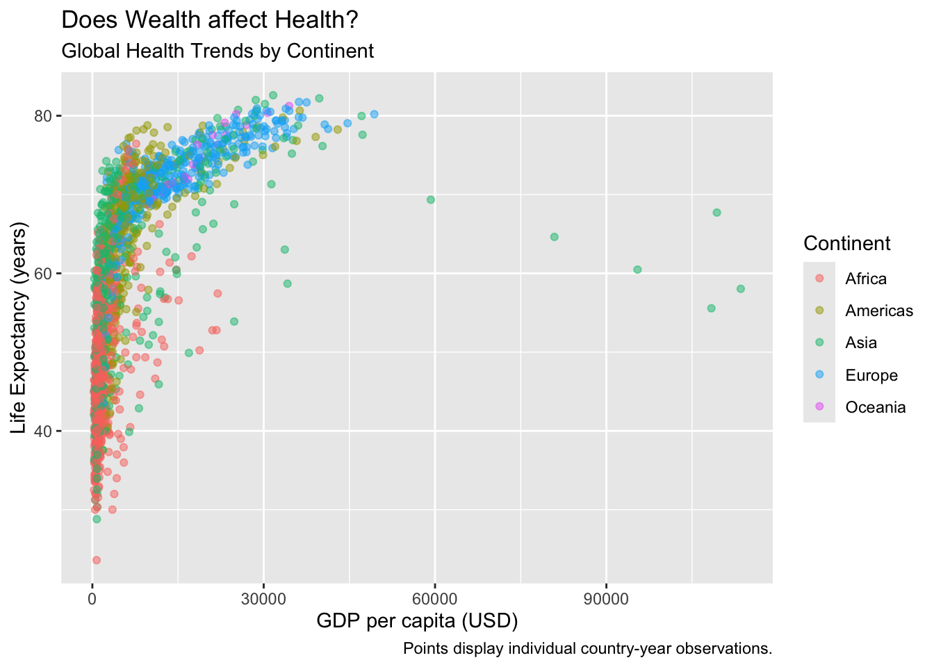
We can (and should!) make our visualizations much more readable by adding appropriate labels.
ggplot(data = gapminder, mapping = aes(x = gdpPercap, y = lifeExp,
color = continent)) +
  geom_point(alpha = 0.5) +
  # Add labels!
  labs(x = "GDP per capita (USD)", # label for x-values
    y = "Life Expectancy (years)", # label for y-values
    color = "Continent", # label for colors
    title = "Does Wealth affect Health?", # overall title
    subtitle = "Global Health Trends by Continent", # subtitle!
    caption = "Points display individual country-year observations.") # caption
We can actually save visualizations as objects too, which can make things faster.
Let's save our visual as myviz
myviz = ggplot(data = gapminder, mapping = aes(x = gdpPercap, y = lifeExp,
                                                color = continent)) +
  geom_point(alpha = 0.5) +
  labs(x = "GDP per capita (USD)",
       y = "Life Expectancy (years)",
       color = "Continent",
       title = "Does Wealth affect Health?", # overall title
       subtitle = "Global Health Trends by Continent", # subtitle!
       caption = "Points display individual country-year observations.") # caption
Next, let's try a few more learning check that will ask you to try our ways to improve the quality and readability of your visuals!
Now run myviz - what happens?
myviz
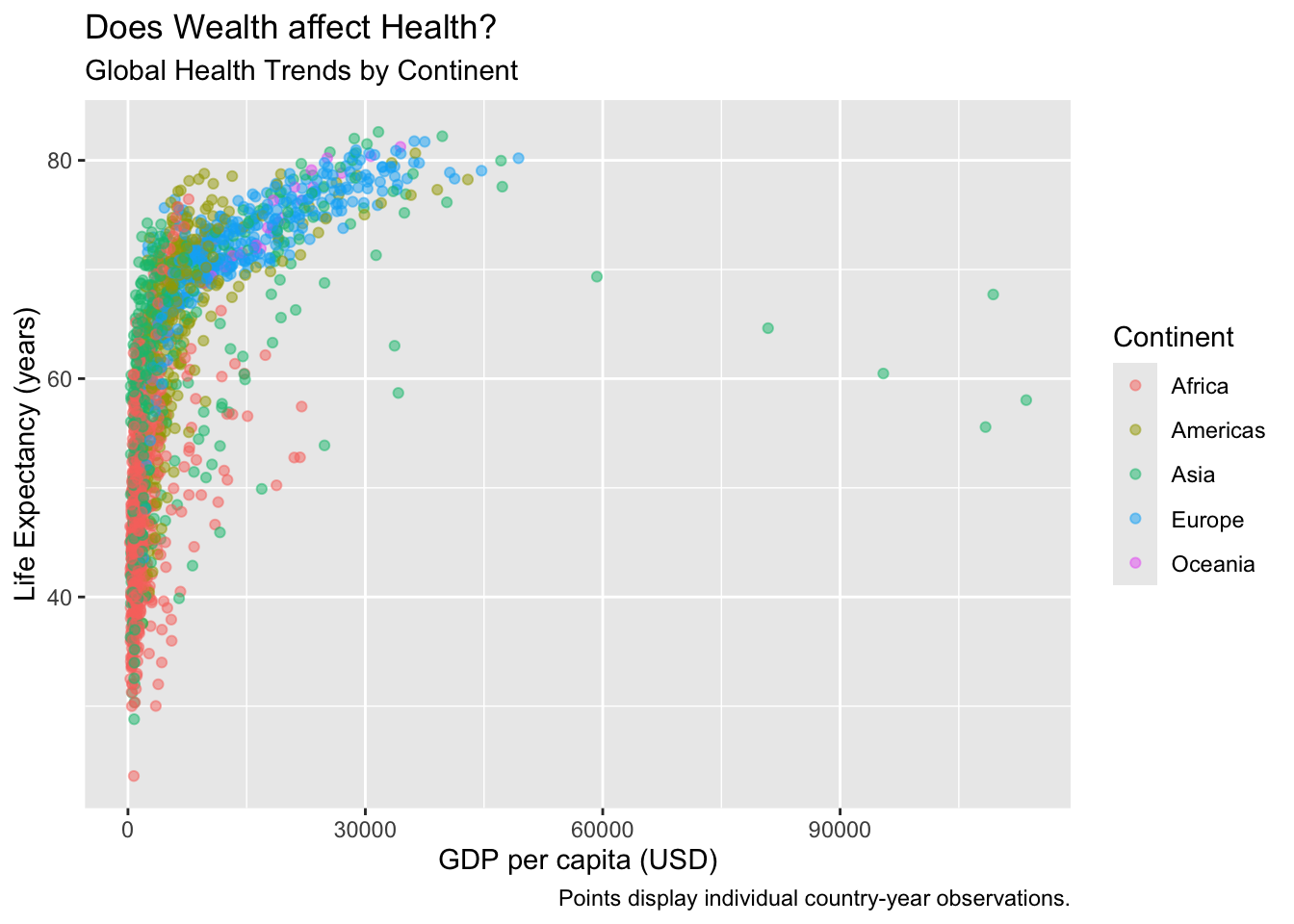
myviz stores the entire ggplot object, not just a picture — running the object name alone at the console is the same as running print() on it.When you save a ggplot to an object, eg. naming it myviz, you can call up the visual again as many times as you want by just running the myviz object, just like any other object.
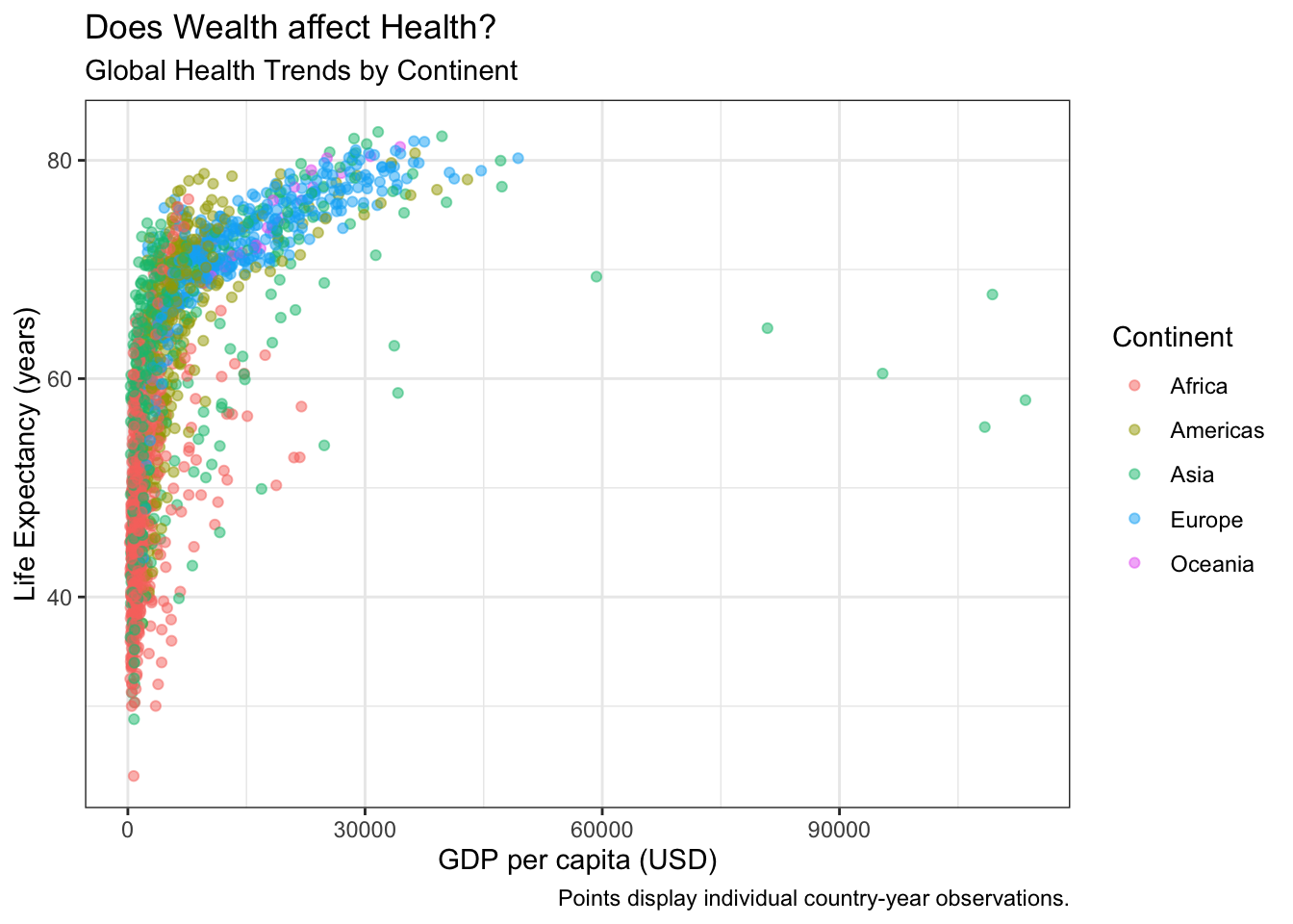
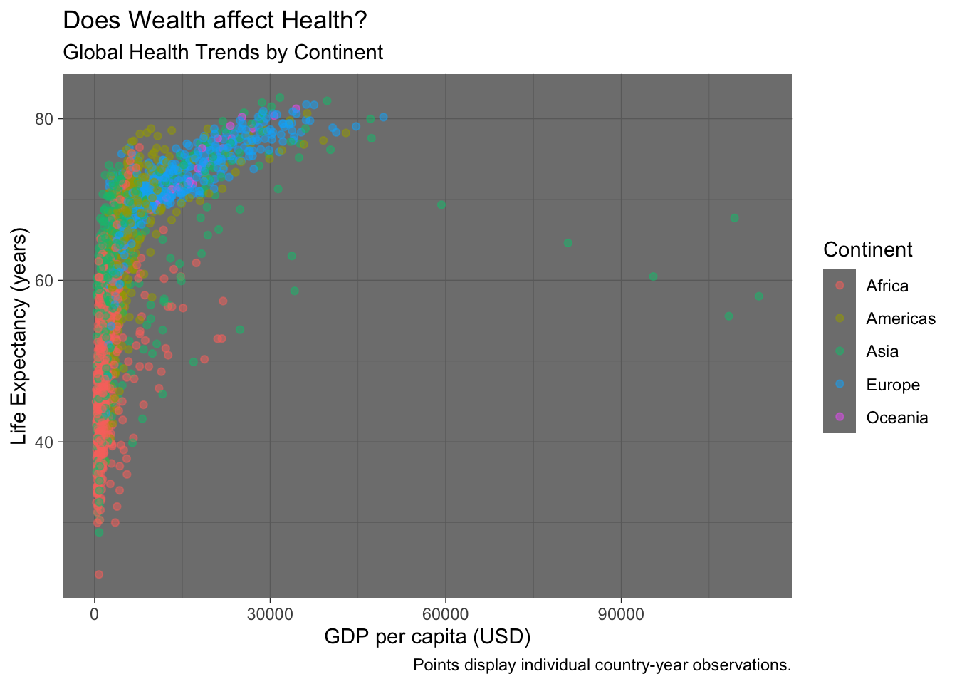
We can do better, adding things onto our myviz object! Try changing themes. What happens below?
# Version theme_bw
myviz +
# How about this theme?
theme_bw()
# Version theme_dark
myviz +
# How about this theme?
theme_dark()
# Version theme_classic
myviz +
# How about this theme?
theme_classic()
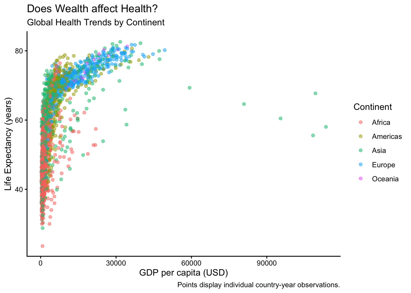
theme_*() function is a complete formatting recipe added with +; try adding one, then swap it for another and compare backgrounds/gridlines.theme_bw() makes a nice black-and-white graph; theme_dark() makes a funky graph with a dark grey background; theme_classic() makes a very simple graph, with fewer distractions.
I personally really like the default theme or theme_bw(). Sometimes theme_classic() can be really helpful if you have a particularly busy visual.
Visualizing diamonds data
Next, let's use the diamonds dataset, which comes with the ggplot2 package This is a dataset of over 50,000 diamond sales.
# Check out first 3 rows...
diamonds %>% head(3)
We can use this visualization to check whether the cut of diamonds really has any relationship with price.
glimpse(diamonds)
Looks like cut is an ordinal variable (fair, good, ideal, etc.), while price is numeric (eg. dollars). A boxplot might be helpful!
ggplot(data = diamonds, mapping = aes(x = cut, y = price, group = cut)) +
  # notice how we added group = cut, to tell it to use 5 different boxes, one per cut?
  geom_boxplot()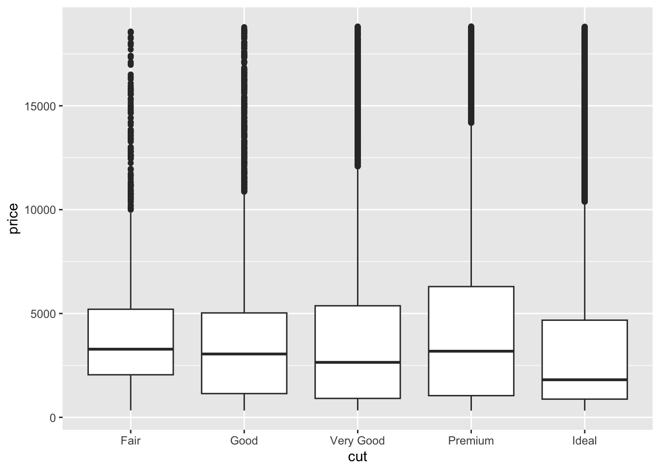
Huh. How odd. Looks like the cut of diamonds has very little impact on what price they are sold at! At least at first glance — this marginal view hides the fact that better-cut diamonds tend to be smaller diamonds, and once you control for carat the picture reverses, a trap we'll learn to catch later in the course.
We can see lots of outliers at the top - really expensive diamonds for that cut.
Let's make this visualization more visually appealing.
What changed in the code to make these two different visual effects? Why? (Hint: fill.)
ggplot(data = diamonds, mapping = aes(x = cut, y = price, group = cut)) +
  geom_boxplot(fill = "steelblue")

ggplot(data = diamonds, mapping = aes(x = cut, y = price, group = cut, fill = cut)) +
  geom_boxplot()
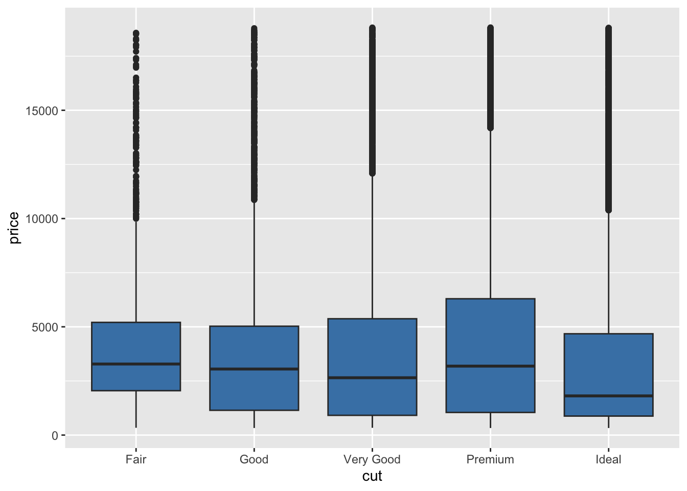
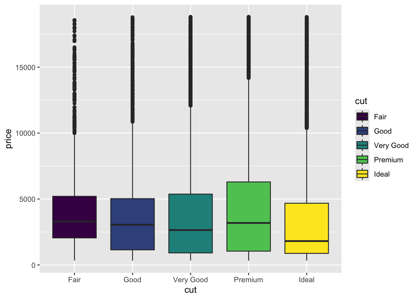
fill = "steelblue" sits (inside geom_boxplot()) versus where fill = cut sits (inside aes()) — same idea as LC3's color logic, applied to fill.In the first visual, we assigned all the boxplots to have the same fill (fill = "steelblue"), but in the second visual, we assigned the boxplot fill to be shaded based on the cut of diamond. This adds a cool color range!
Visualizing Distributions
Different geom_ functions use colors in different ways, but this is a good example.
For example, below is a histogram. It visualizes the approximate distribution of a set of values.
We can see how frequently diamonds are sold for certain prices versus others.
ggplot(data = diamonds, mapping = aes(x = price, group = cut, fill = cut)) +
  geom_histogram(color = "white") + # notice new function here
  labs(x = "Price (USD)",
    y = "Frequency of Price (Count)",
    title = "US Diamond Sales")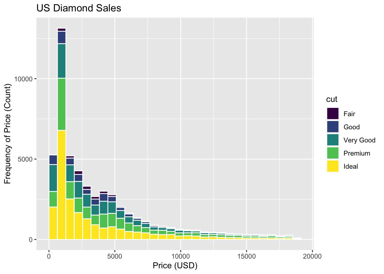
Are most diamonds cheap or expensive? What type of distribution would you call this?
This is strongly right-skewed distribution, because the majority of the distribution leans to the left (the clump of the data), while it has a long tail that skews to the right. The median is typically less than the mean in a right skewed distribution.
Conclusion
You made it! You have now tried out a series of visuals in ggplot. We will use ggplot a lot in this course, so please be sure to reach out when you have questions, talk with others in your group, and work together to build great visualization skills! (Plus, it's super applicable professionally!)