Visualization with plotnine in Python
Visualization is a key part of statistical analyses, especially in systems engineering. In this tutorial, we'll learn to visualize data with plotnine (the Python port of ggplot2).
Please follow along using the code below!
Getting Started
Loading Packages
import pandas as p
from plotnine import *
from gapminder import gapminder as gapminder

# diamonds bundled with plotnine
from plotnine.data import diamonds
Gapminder data
# View it in the console
gapminder
# Glimpse-like summary
gapminder.dtypes, gapminder.shape
Your first scatterplot
# make the folder we save figures into
import os; os.makedirs("plotnine_figures", exist_ok=True)
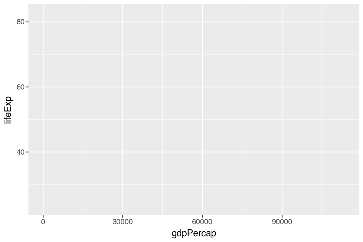
p1 = ggplot(data=gapminder, mapping=aes(x='gdpPercap', y='lifeExp'))
p1.save("plotnine_figures/01_scatter_base.png", dpi=200, width=6, height=4)
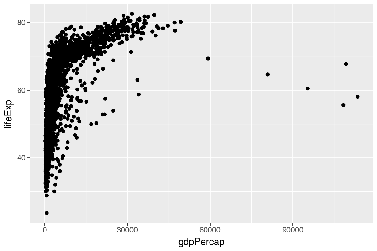
Add points with + geom_point().
p2 = (ggplot(gapminder, aes(x='gdpPercap', y='lifeExp')) + geom_point())
p2.save("plotnine_figures/01_scatter_points.png", dpi=200, width=6, height=4)
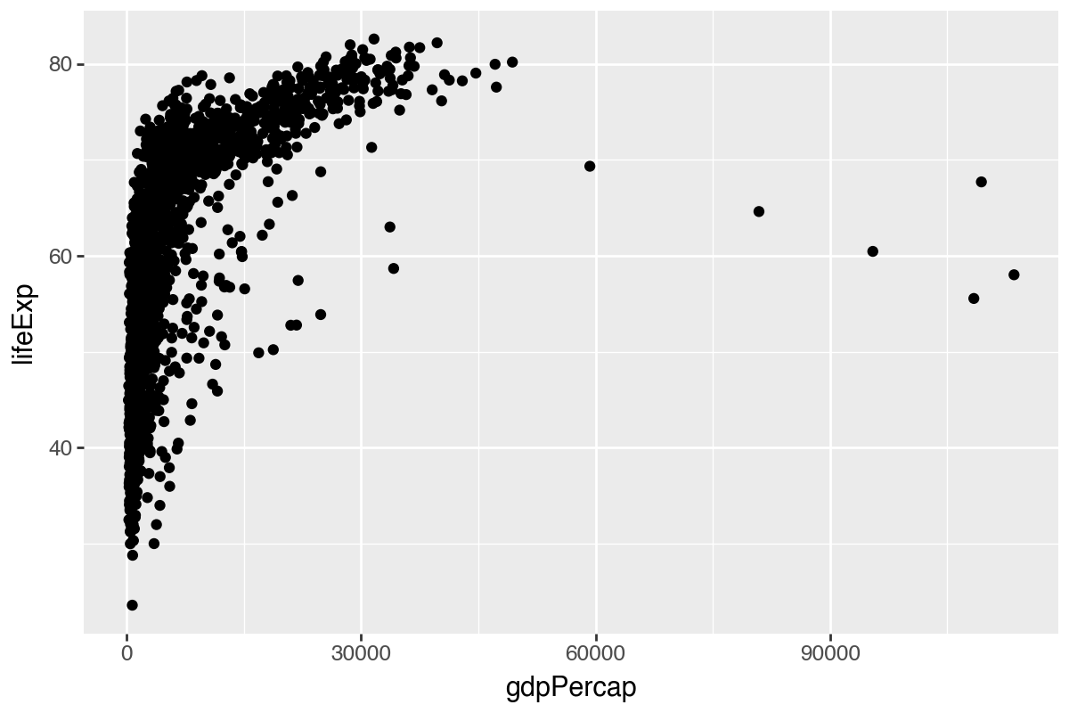
As wealth per person (GDP per capita) increases, life expectancy rises quickly then tapers off. This shows a strong relationship between wealth and health.
Transparency (alpha)
p3 = (ggplot(gapminder, aes(x='gdpPercap', y='lifeExp')) + geom_point(alpha=0.2))
p3.save("plotnine_figures/01_scatter_alpha02.png", dpi=200, width=6, height=4)
p4 = (ggplot(gapminder, aes(x='gdpPercap', y='lifeExp')) + geom_point(alpha=0.5))
p4.save("plotnine_figures/01_scatter_alpha05.png", dpi=200, width=6, height=4)
p5 = (ggplot(gapminder, aes(x='gdpPercap', y='lifeExp')) + geom_point(alpha=1))
p5.save("plotnine_figures/01_scatter_alpha1.png", dpi=200, width=6, height=4)
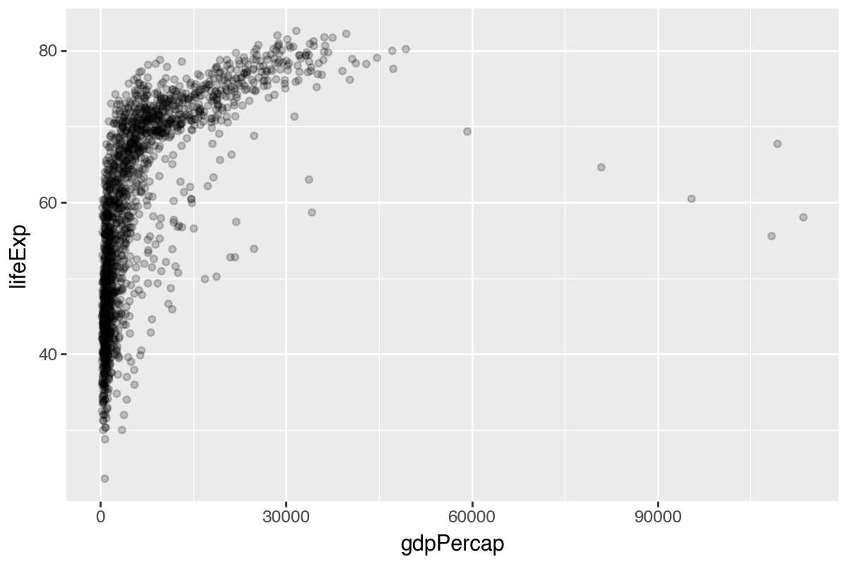
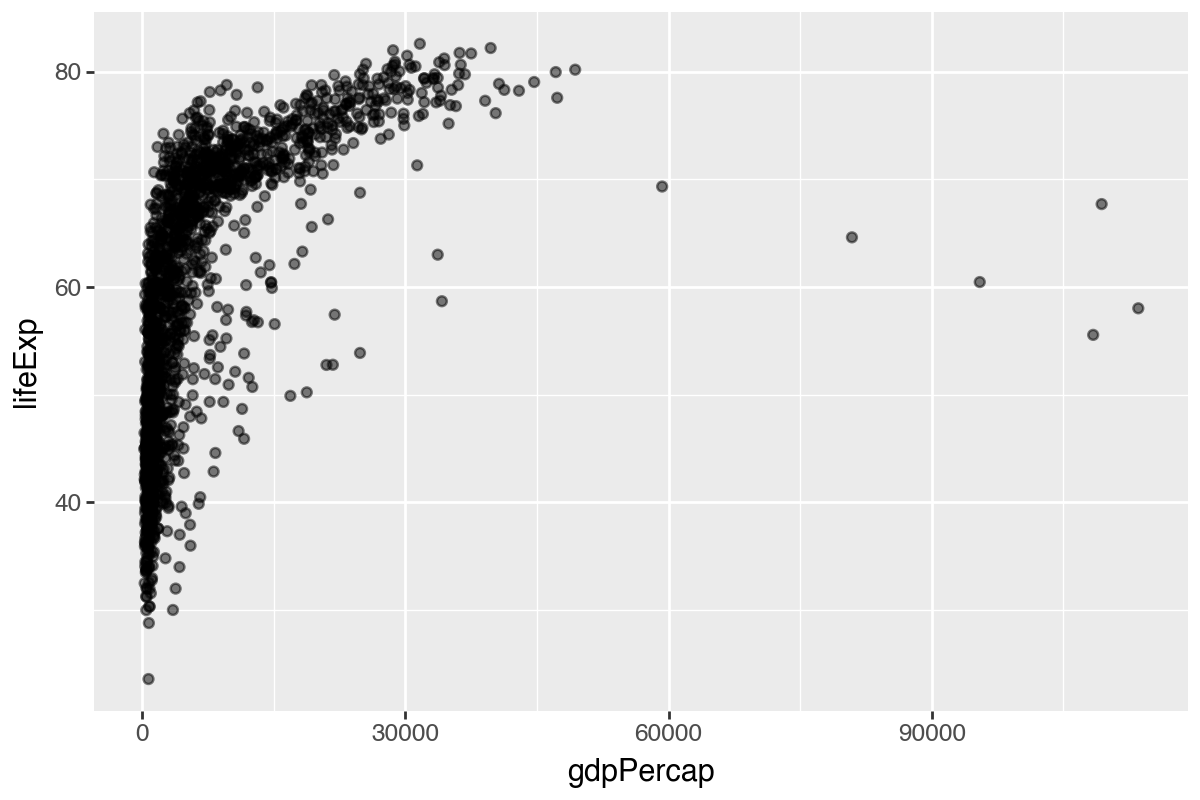
alpha across the three visuals above?alpha is a geom_point() argument that controls point opacity. Compare what happens to overlapping points as the value moves from near 0 toward 1.alpha controls transparency from 0 to 1. Higher values are more opaque; lower values are more transparent.
Color: constant vs mapped
# Single color
p6 = (ggplot(gapminder, aes(x='gdpPercap', y='lifeExp')) +
  geom_point(alpha=0.5, color='steelblue'))
p6.save("plotnine_figures/01_scatter_single_color.png", dpi=200, width=6, height=4)

# Color mapped by continent
p7 = (ggplot(gapminder, aes(x='gdpPercap', y='lifeExp', color='continent')) +
  geom_point(alpha=0.5))
p7.save("plotnine_figures/01_scatter_mapped_color.png", dpi=200, width=6, height=4)
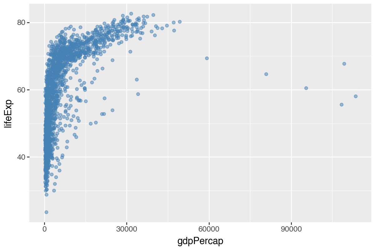
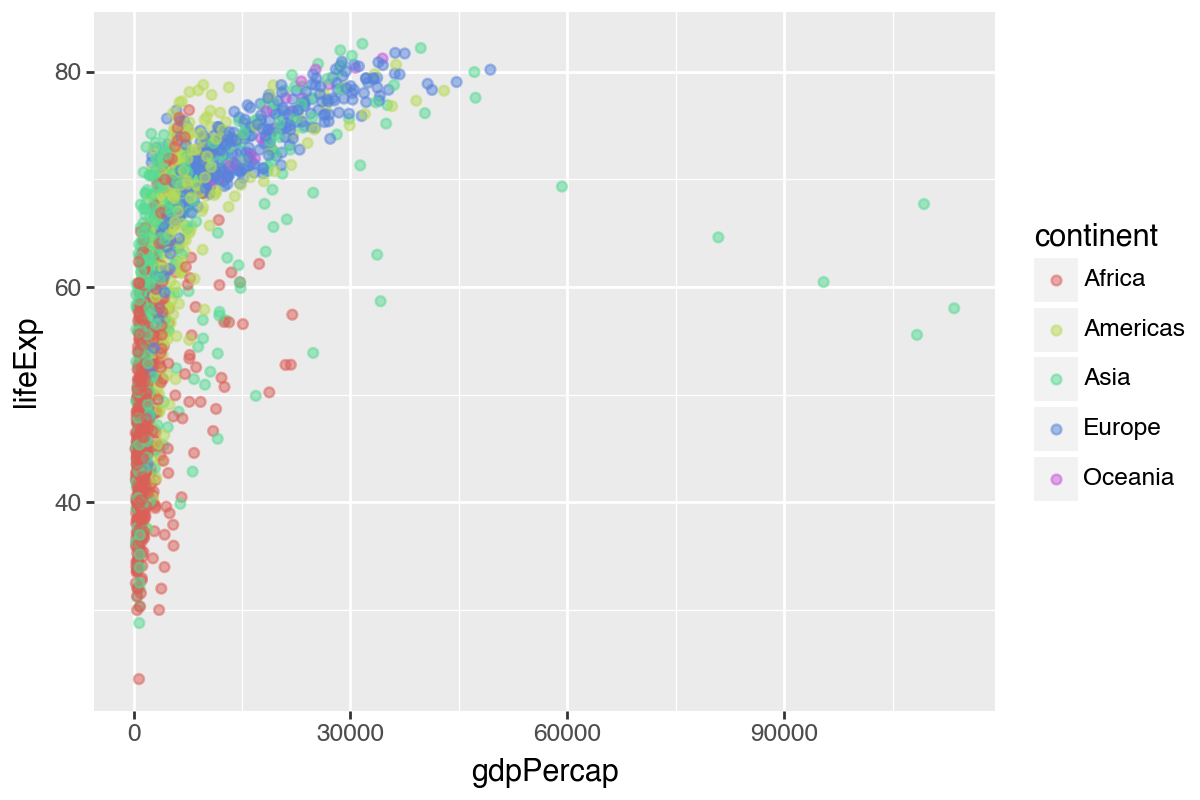
color for a single color vs. multiple colors based on a variable?aes() or outside it.Single color: set color inside geom_point(color='...') (outside aes). Mapped colors: set color inside aes(color='variable').
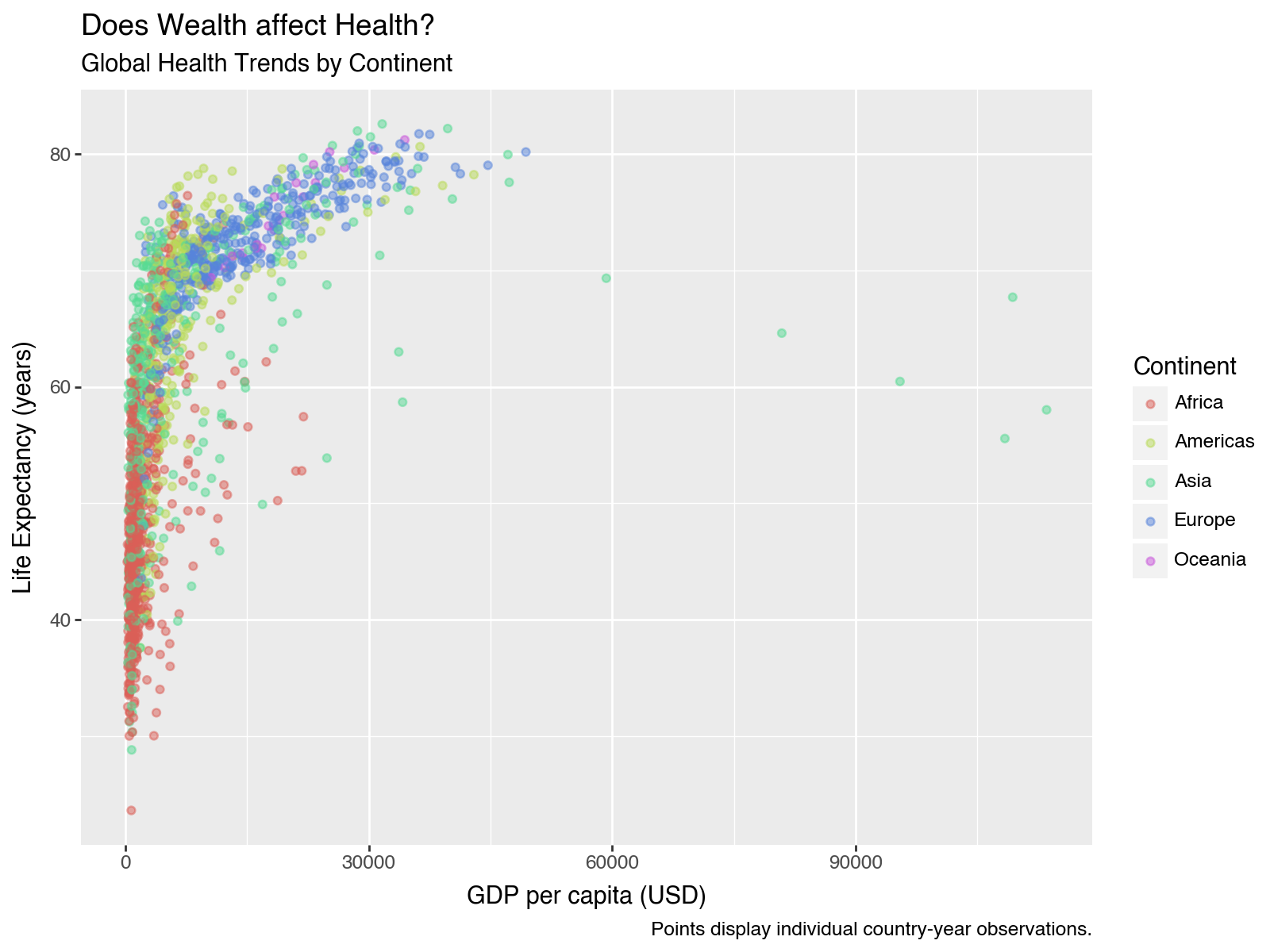
Improving our visualizations
p8 = (ggplot(gapminder, aes(x='gdpPercap', y='lifeExp', color='continent')) +
  geom_point(alpha=0.5) +
  labs(x='GDP per capita (USD)',
       y='Life Expectancy (years)',
       color='Continent',
       title='Does Wealth affect Health?',
       subtitle='Global Health Trends by Continent',
       caption='Points display individual country-year observations.'))
p8.save("plotnine_figures/01_scatter_improved.png", dpi=200, width=8, height=6)
You can save visuals as objects to reuse them.
myviz = (ggplot(gapminder, aes(x='gdpPercap', y='lifeExp', color='continent')) +
  geom_point(alpha=0.5) +
  labs(x='GDP per capita (USD)', y='Life Expectancy (years)', color='Continent',
       title='Does Wealth affect Health?', subtitle='Global Health Trends by Continent',
       caption='Points display individual country-year observations.'))

myviz.save("plotnine_figures/01_myviz_default.png", dpi=200, width=8, height=6)
(myviz + theme_bw()).save("plotnine_figures/01_myviz_bw.png", dpi=200, width=8, height=6)
(myviz + theme_dark()).save("plotnine_figures/01_myviz_dark.png", dpi=200, width=8, height=6)
(myviz + theme_classic()).save("plotnine_figures/01_myviz_classic.png", dpi=200, width=8, height=6)
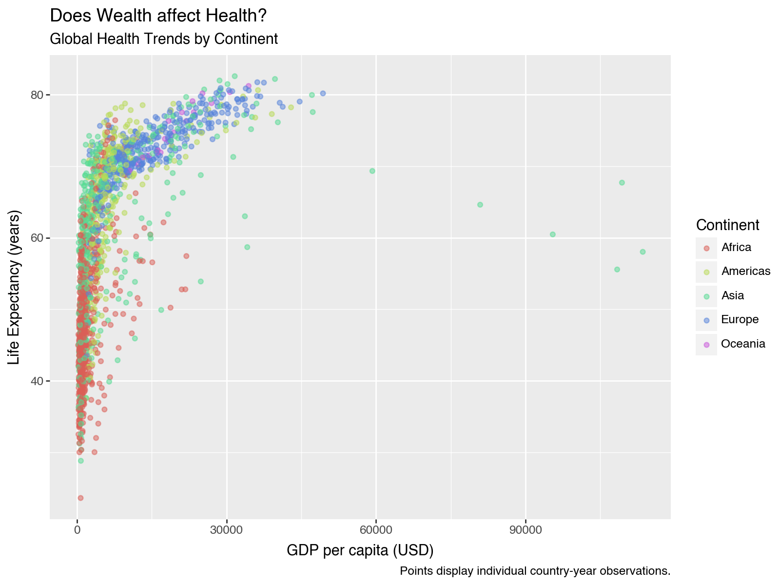
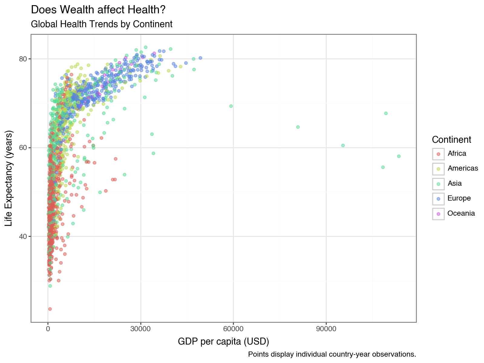
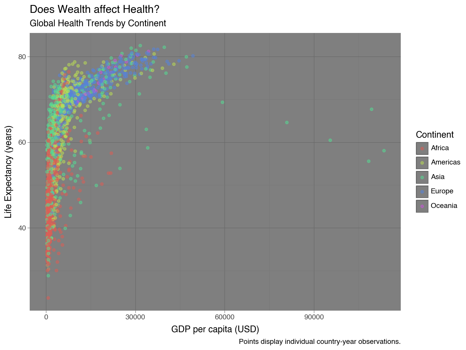
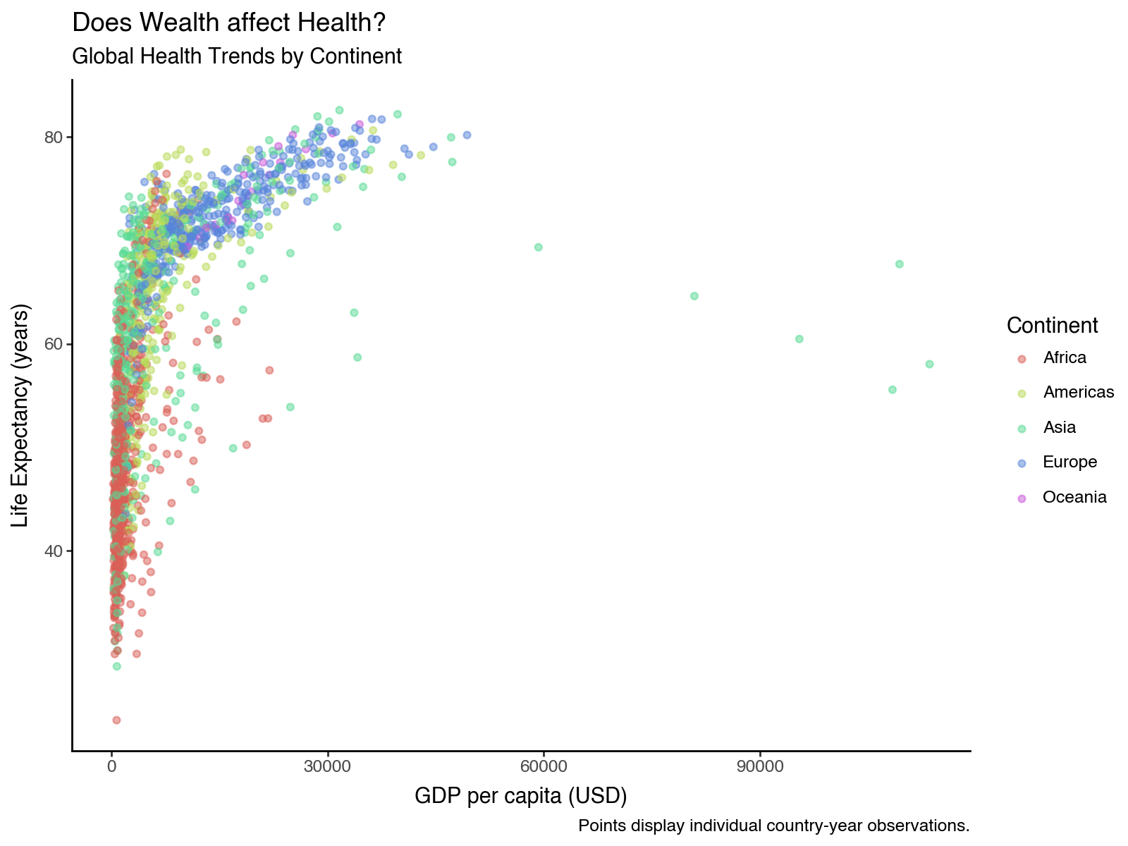
Now run myviz on its own - what happens?
myviz
myviz stores the entire ggplot object, not just a picture - so you can display it again, or add more layers onto it with +, without rebuilding it.When you save a plotnine plot to an object, eg. naming it myviz, you can call up the visual again as many times as you want by just running the myviz object, just like any other object. In a notebook, the object displays itself; in a script, use print(myviz) or myviz.save(...). Because it is still a live plot object, myviz + theme_bw() returns a new plot with that theme, leaving myviz untouched.
Visualizing diamonds data
diamonds.head(3)
diamonds.dtypes, diamonds.shape
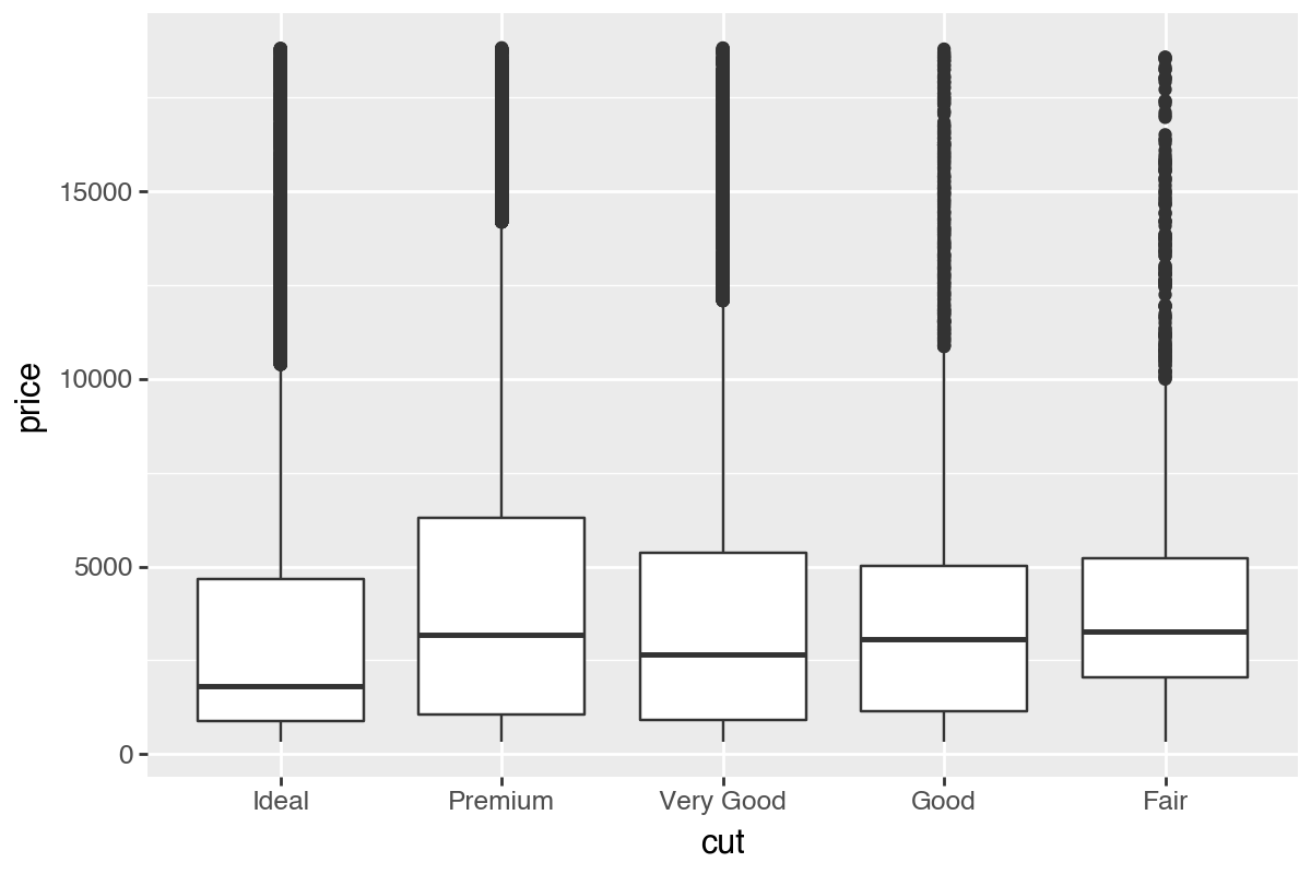
Boxplots by cut
p9 = (ggplot(diamonds, aes(x='cut', y='price', group='cut')) + geom_boxplot())
p9.save("plotnine_figures/01_boxplot_default.png", dpi=200, width=6, height=4)
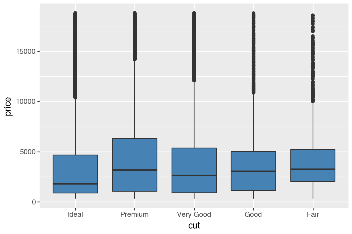
p10 = (ggplot(diamonds, aes(x='cut', y='price', group='cut')) +
  geom_boxplot(fill='steelblue'))
p10.save("plotnine_figures/01_boxplot_fill.png", dpi=200, width=6, height=4)
p11 = (ggplot(diamonds, aes(x='cut', y='price', group='cut', fill='cut')) +
  geom_boxplot())
p11.save("plotnine_figures/01_boxplot_mapped_fill.png", dpi=200, width=6, height=4)
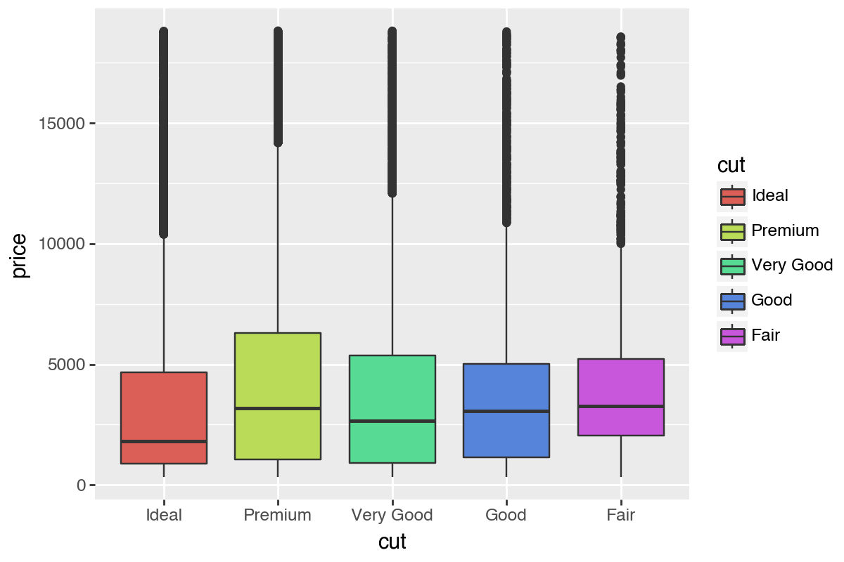
fill='steelblue' sits in the geom_boxplot() call versus where fill='cut' sits — one is a fixed argument to the geom, the other lives inside aes().Constant fill uses geom_boxplot(fill='steelblue'). Mapped fill uses aes(fill='cut') to color by variable.
Visualizing Distributions
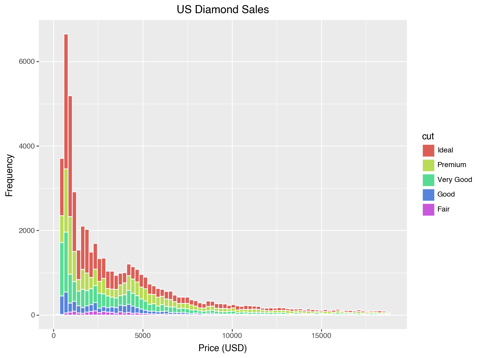
p12 = (ggplot(diamonds, aes(x='price', fill='cut')) +
  geom_histogram(color='white') +
  labs(x='Price (USD)', y='Frequency', title='US Diamond Sales'))
p12.save("plotnine_figures/01_histogram_default.png", dpi=200, width=8, height=6)
Try adjusting binwidth and theme
p13 = (ggplot(diamonds, aes(x='price', fill='cut')) +
  geom_histogram(color='white', binwidth=500) +
  theme_classic() +
  labs(x='Price (USD)', y='Frequency', title='US Diamond Sales (binwidth=500)'))
p13.save("plotnine_figures/01_histogram_binwidth.png", dpi=200, width=8, height=6)
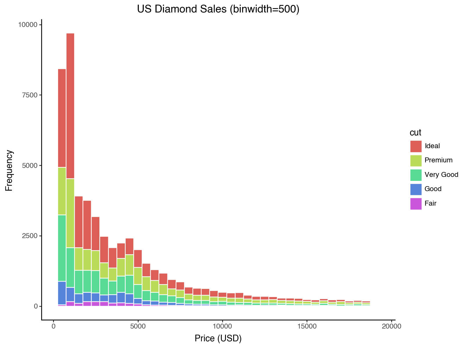
price with a narrower binwidth and apply a different theme. Which choices improve readability?binwidth in geom_histogram() controls how wide each bar's price range is — smaller values show more detail. Try swapping in theme_bw(), theme_dark(), or theme_classic() to change the background and gridlines.p14 = (ggplot(diamonds, aes(x='price', fill='cut')) +
geom_histogram(color='white', binwidth=250) +
theme_bw() +
labs(x='Price (USD)', y='Frequency'))
p14.save("plotnine_figures/01_histogram_answer.png", dpi=200, width=8, height=6)
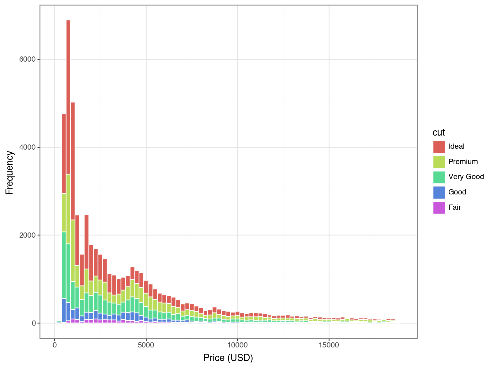
Are most diamonds cheap or expensive? What type of distribution would you call this?
diamonds histogram: is the tall clump of bars on the low-price end or the high-price end, and which side has the long thin tail? Comparing diamonds['price'].median() to diamonds['price'].mean() is a quick numeric check.This is a strongly right-skewed distribution, because the majority of the distribution leans to the left (the clump of the data), while it has a long tail that skews to the right. The median is typically less than the mean in a right skewed distribution - and sure enough, diamonds['price'].median() comes in well below diamonds['price'].mean().
Conclusion
You learned how to build scatterplots, boxplots, and histograms with plotnine and how to control transparency, color mapping, labels, and themes.